Well, I promise my artwork would be showcased here, so here it starts. And it starts with an art project for Aion, where once a Legion advances high enough in rank, the legion (guild) emblem can be customized. I.E., not a pick from the given choices. An image you make/take, and upload. So without further ado...
http://quacthulhu.deviantart.com/
This was my first "finale", but the road to it was tough. I started with the Elf "wings" icon/wallpaper from Warhammer Online, altered the colors until I could clearly extract the wings from the background, remove the object sandwiched between the wings, then use The GIMP (GNU Image Manipulation Program) 2.6.2 to essentially light-box over the wings to get a good trace. I then added extra lines to "complete" the wings as close to whole as possible, but only worked on one half of the set. The other half was a simple copy & flip away. They remind me of a sparrow's wings in a way, with no clear boundary between primaries and secondaries...
Anyway, the wings outlined and the reference image thrown away, coloration was done with a gradient tool and a lot of toying around with the options. Gradients in GIMP aren't too flexible. Eventually I got what you see in the background here, but with white outlines. I painted over them later to ease them into the image better. Things were going to get "loud" enough as it stood.
The shield came next, and I started with the icon for the Aion character class of Templar, which is the penultimate tank class. The image came to me as a black & white PNG. Fuzzy select and gradient fill once again came to my rescue, but not easily. The golden/raised areas and the firey/depressed areas would not be filled with gradient in the same image without leaving lines between the two area types. I had to do each of the areas as separate images, then copy the top one over with transparent gaps, on top of the lower/red gradient. The finished shield didn't come out as well as I wanted, but since the image was to be scaled down anyway, I figured it was good.
But I wasn't done yet. I wanted more added on to this monster.
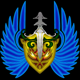
Came then the Ranger class icon, which consists of a dagger/sword plus bow. I thought it would go nice with the shield and wings. But look at how 'loud' and busy the image is now! I was originally also going to put something in reminiscent of spell casters or priests, but there's no room! That's okay, I thought, the Legion is named "Sacramentum" which means "Oath (of soldiers)". Swords and shields and bows were more mindful of that, right? The ranger icon came to me differently than the Templar icon. It was also in black & white, but the quality was much poorer. I had to manually sharpen the image bit by bit, then go in with the path tool to even out the lines and gaps, and erase parts that would be too tiny to see at the ultimate resolution. The dagger/sword part came out okay with the special gradient used there, maybe it could have used more or less "frivolous-ness". The bow, however, came out for the worse. I played with the gradient, determined to have another color on that image that didn't blend with the rest, but green just came out too dark!
I'll have to work on another one, one where the green bow portion is perhaps moved around a bit? Or removed completely. Or perhaps just colored like the sword/dagger. It's that or I use the "Gladiator icon" for more effect. We'll see, but this has been enough work for one night.
 EDIT: Dammit, no. You can't take my image without permission. No, you can't use it for your guild, I made it for my own. Have some decency. I appreciate that you like it but please, I spent all my free time on this for my Legion. I'd be willing to share my source material for you to make your own, but this beauty is my own, my current pride and joy.
 Now imagine it smaller...
